Saturday, January 28, 2012

Photo Project

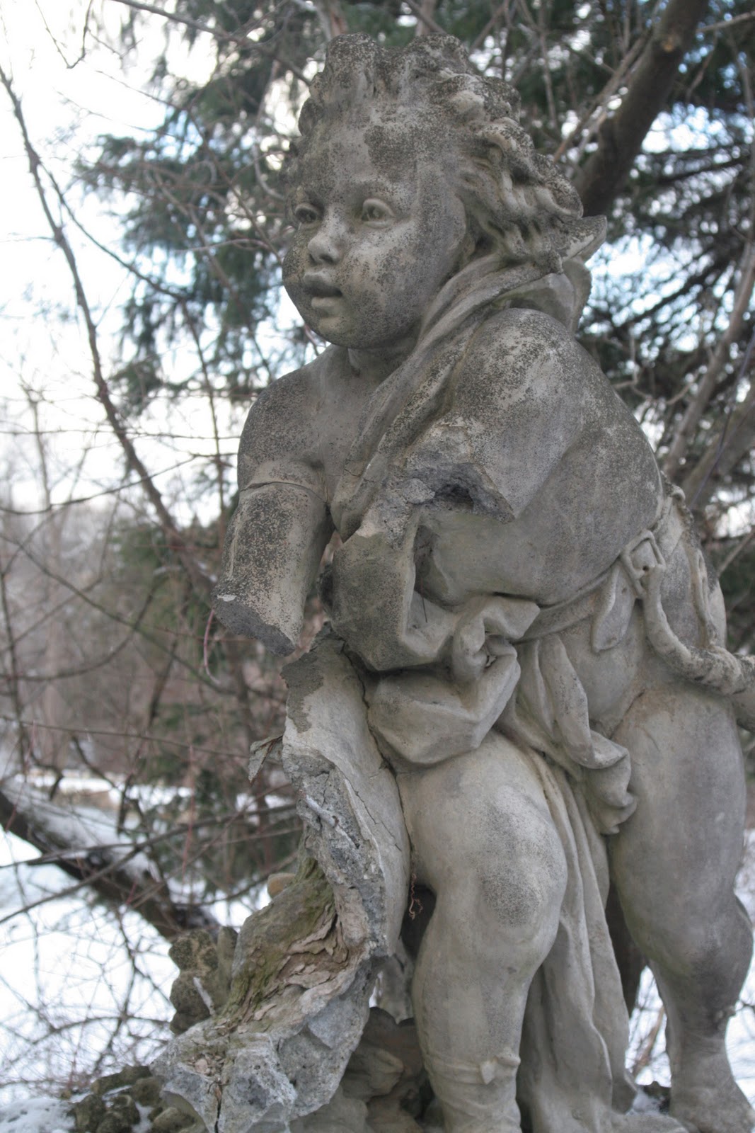
   So I sat around/ staring around today trying to think of something compelling to photograph. I had already decided to photograph the same thing twice (one normalish and one more compelling) using ideas from the videos and reading to change the first into something great. I decided to go for a walk around the gardens at Cranbrook (an art museum/school in Michigan). Braving the blistery cold wind I finally found this statue. It was one of the only ones not covered up for the winter and I first thought it might have been forgotten as it was tucked away down a wooded path. I would also like to ad there was no photoshop done to these.

Here is picture one. Normal (snap shot) picture.
I think its an interesting photo but fails at being compelling for a few reasons. First the background is far too busy. The tree branches jut out from behind it at all angles and don't add to the movement but just create chaos. Second I didn't do a very good job of framing it. The feet are cut off. Second, because of the plain and flat lighting there really isn't any mood to it. It is almost an archival photo. I don't get any emotion off the face of the cherub or get interesting feelings from the broken hands. Last, the exposure is a little too light in the background (the white snow is a little blown out). And the lighting makes it seem very flat, lacking depth.

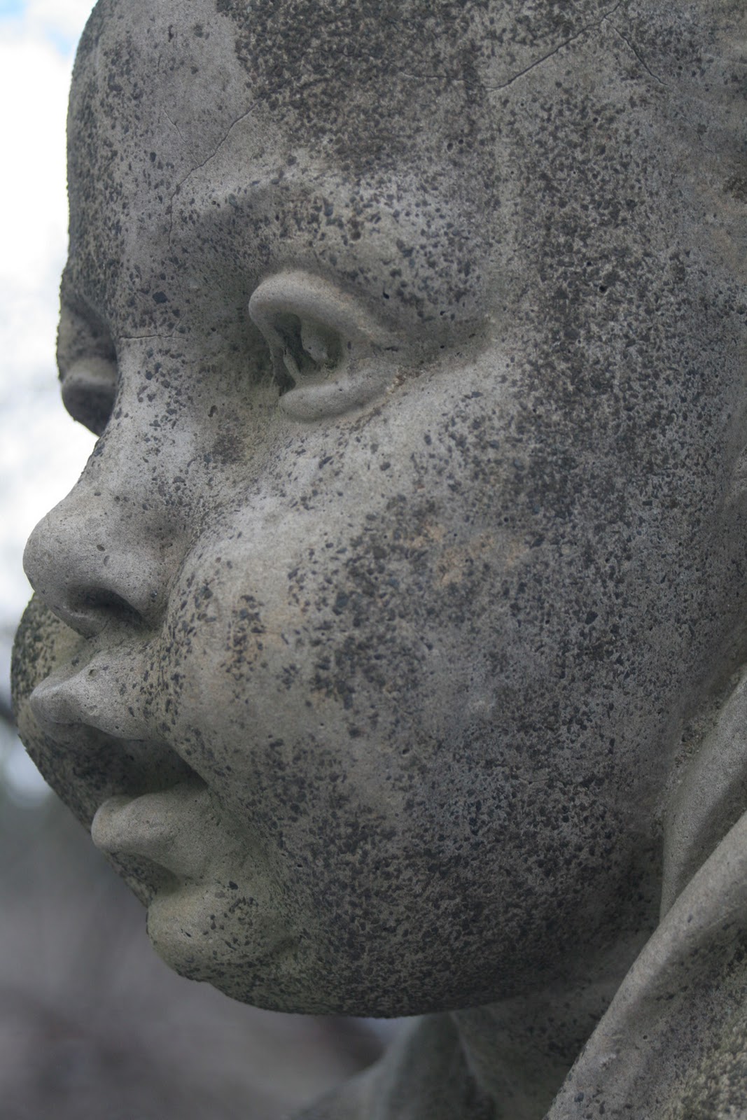
Here is picture two. Compelling.
I tried many different views and framing of the statue to change the snapshot into something that spoke to me and this was my favorite. First, I would like to blame this computer for the exposure (on my laptop screen - where I have photoshop - the background next to the face is NOT blown out but a nice wintery blue) so please try to ignore how it blends in with the blog background that was not part of the idea. Second, the lighting here does allow for dimension. It brings the roundness of the face out and although shot with a very small f-stop gives it a nice sense of depth. Third, I really focused on the cropping. I took from the video the idea of reducing. The statue had a lot going on - broken parts, beautiful carvings, snow, vines, and more - but once I narrowed down on just the face I saw the emotion it evoked. Its very realistic looking - the cheeks and lips - and I like the double take a viewer might have to do. Then the gaze is off to the distance. I picked this specifically (instead of photographing it from head on) to make the viewer wonder what the statue sees.

When I think of the message I want sent with this versus the first one I think of a baby frozen and still. The first image (although in that one you can tell its a cherub) is a baby still in its normal chaotic atmosphere while this second one is more compelling because of its stillness.

Hope you enjoy!
- Carolyn

Tuesday, January 24, 2012

The Jabberwock

I was reading a book for another of my grad classes and came across a passage that I found not only interesting but meaningful for this class as well. The book is Probing Understanding by White, R. and R. Gunstone (1992). The book starts with breaking down types of understanding so that we - as educators - can see if our students "understood" what we have been teaching. In the fourth type: Understanding Extensive Communications they talk about how long pieces of work are understood through a process and not static single elements. The idea that you watch an entire ballet to understand and not try to pick apart each dance step to find the meaning. The authors then use a passage from Lewis Caroll's poem Jabberwock.

And as in uffish thought he stood,
The Jabberwock, with eyes of flame,
Came whiffling through the tulgey wood,
And burbled as it came!

I thought this linked very well with our look into what makes signs or photos compelling. The main idea that you don't have to understand what uffish means to get a sense of what the poem is saying. Imagery can be comprised of very confusing bits (like the travel ticker photo from the video we watched) but give a sense of feeling and lead to an understanding through that.

I think people too often try to understand each little bit and dissect it until they think they find the meaning when the intended meaning was right there all along if they looked long at the whole and not dissect the parts.

Thursday, January 19, 2012

Bridges

    So I was thinking about the connection between Art and art some more. And then relating both back to education. The images we have looked at for our second week discussion are simple exercises on design principles. I was actually a photography major in college and spend countless nights working things like this out for my own projects (usually to have my 'theories' on human attention torn apart in critique the next day). I have also already started the two photos project. I am thoroughly enjoying the challenge of making a good photo and a less than one.
     But back to linking it to education. I think my group (group 2) had a great discussion going about educational material and how students see it. What catches their eye versus what would catch an adults eye. We were talking about how people are trained to read left to right. And this is very important for young students who are just starting to read. I substituted a kindergarten class the other day and was reading a book out loud for them that had many different pictures and word captions all over the page. Reading upside down (so they could see the pictures) I often found myself missing or going out of order. The little 5 year olds were better at staying left to right and top to bottom and would correct me. But the flow of the book to me was different.
     I think it is very important when designing educational material to know your target audience (what grade/reading level you are aiming for) and see art through their eyes.
    Thats all for today I am off to play in the snow with my puppy (it has finally snowed here in Michigan!)
   - Carolyn

Welcome!

Hello!
Welcome classmates (and professor!) to my blog for CEP 882. Enjoy!